Why CartoDB
About a year ago, I posted a brief tutorial on ESRI’s StoryMaps, a lightweight ArcGIS web mapping platform. This time around, I want to share a similar tutorial on the CartoDB platform. Whereas StoryMaps is a very minimal mapping platform designed to let users craft a narrative around a simple dataset, CartoDB provides a more robust set of mapping tools to display multiple datasets, increase customizability, and in general, do more with your data.
I first started playing with CartoDB earlier this year while working on a project aimed at visualizing the impacts of the CUNY Grad Center across NY and the world. You can view one of the maps for this project, created by Steve Romalewski: Where Are GC Students Teaching.
CartoDB is a web-based open source mapping platform, which can be installed on your own server, or used as a cloud-based mapping service through CartoDB.com. CartoDB.com offers different price tiers, including a free tier for lightweight mapping with small datasets.
For this tutorial, we will be using the free tier service to create a really simple map that will teach you the basics of importing data, applying different visualizations, using filters, and creating data interactivity.
Tutorial Data
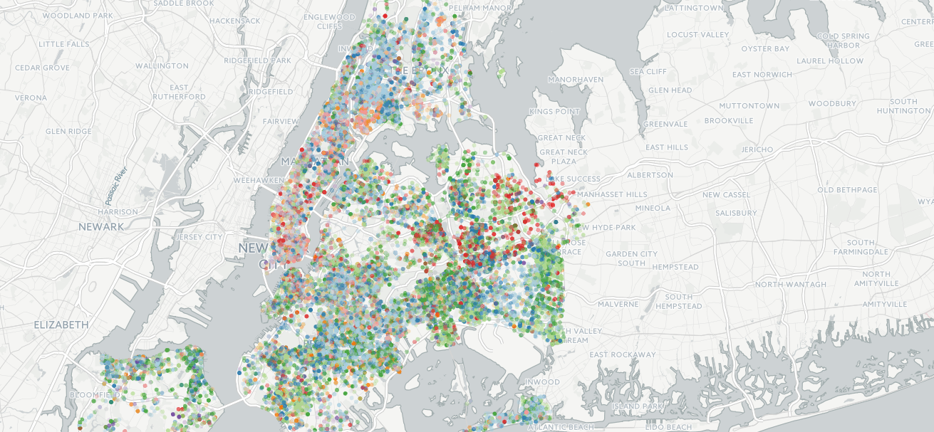
GIS data and mappable datasets are widely available across the web. If you are dealing with New York, one great resource is the NYC Department of City Planning Bytes of the Big Apple website, which contains downloadable datasets related to administrative and planning boundaries. If you want to incorporate US Census Data, the easiest way to get recent data is by using the TIGER datasets, although they aren’t available for every geography and time period. In this tutorial, we will be using a dataset that I pulled from the NYPD Stop, Question and Frisk (aka Stop and Frisk) database.
To simplify the data import process, I created a slightly modified dataset based on the 2014 SQF data by converting the geocoordinates embedded in the files (based on the NY-Long Island state plane system) to a format that CartoDB natively understands (for details on this process, see note 1 below).
Download the dataset here: 2014 NYPD Stop Question Frisk Database
Most datasets will have metadata associated with them. This data is no different. You can download the metadata descriptors for this dataset here: NYPD Stop Question Frisk Database File specifications
The first sheet in the file specification spreadsheet describes each column in the dataset. The second sheet contains the database code values used within each column (e.g., Y=Yes, N=No).
Sign-up on CartoDB.com
The first thing you will need to do is to create an account on CartoDB.com.
Once you’ve verified your account, log in and you should be taken to your personal CartoDB dashboard, where you can watch their snazzy screencast showing you how to get started. Below the video is a place to import your first dataset, which is where we begin with the next step.
Import Data
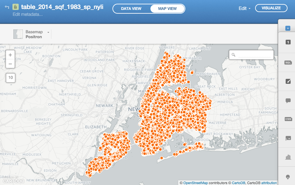
Once you’re logged in to CartoDB.com, click the “Create your first table” button near the bottom of the page and select the .zip file containing the NYPD SQF data that you just downloaded.
Play with the Data
The best way to learn CartoDB is by playing around and seeing what you can do! Click on the “MAP VIEW” tab at the top of the page to visualize the data.
Click the “Wizards” button on the toolbar along the right edge of the screen (the paintbrush). Try out the different types of maps, play with the options, select different columns to display, etc. Refer to the metadata file specifications linked above to gain a better understanding of what each data column represents and what the codes mean (the second tab in the spreadsheet).
Change the Visualization
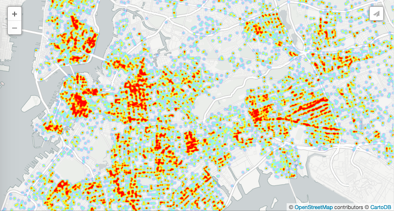
Now that you’ve explored the data a bit, let’s set the visualization so that we’re on the same page. Select “Heatmap” from the visualization wizard. In marker size, select “6”, opacity “0.5”, not animated, and resolution “2”. These settings give a nice balance between data resolution while maintaining a meaningful heatmap effect.
Filter the Data
With large datasets, it’s often helpful to filter the data so that you get a more precise understanding of different phenomena. In CartoDB, you have two options. You can filter data using SQL queries (the SQL button on the toolbar), or the more basic filter tool (the “filters” button at the bottom of the toolbar).
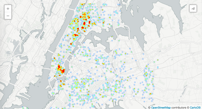
Click the “filters” button. In the dropdown menu, select the “arstmade” (Was an arrest made?) column. This will display a card that allows you to turn on or off datapoints corresponding to different values. If you uncheck the “Y” value, the map only displays SQFs where the person was NOT arrested (only “N” values are displayed). Notice that a huge majority of the SQFs resulted in no arrest.
Next, click the “+” button below the first filter to add a second filter column. Select “forceuse” (reason for the use of force) for the second filter. Uncheck the “null” values (no reason given, we’ll assume this means no force was used; see note 2 below). There should only be a fraction of the original points left. But it’s a bit interesting that there are still quite a few incidents where force was used, yet no arrest was made. Also notice how a lot of those seem to be clustered around the central parts of the Bronx…
Make the Map Interactive
Next we will add info windows to the data that pop up when you hover the mouse over a datapoint or click on it.
First, we need to change the map type to one that shows discrete data points. Go back to the wizard tab, select “Category”, then set the following options: Column=”detailCM” (suspected crime code); Marker fill=5, 0.4; Marker stroke=0,1; “Y”/”N”=colors of your choice.
Next, go to the “infowindow” tool item, then click the “Hover” tab. Pick one or more columns to display when the mouse hovers over a data point. I chose “crimesusp”, “contrabn”, “arstmade”. Now move your mouse over a data point on the map and it should display a window with the selected items. You can do the same for the “Click” tab, except those will display when the data point is clicked. Hover is good for quick data, while click is more appropriate for detailed information. I added “forceuse”, “explnstp”, and “frisked” columns for the click window.
In both the Hover and Click tabs, you can rearrange the displayed items by dragging them up and down the list.
Add a Legend and Publish
The next thing we will do is add a legend to the map so that people viewing it know what the map symbols represent. Click on the “legends” tool item, then select “custom” from the drop-down menu. This will allow us to customize the category names since the default crime codes aren’t very reader-friendly. Referring back to the metadata spreadsheet, we can fill in descriptors for each of the top crime codes reported as justification for the SQF incidents. For example, “20” is the code for “CPW”, or criminal posession of a weapon, which is the top reason for SQFs. Click on the “20” in the first row and change the text to something human-readable, like “Criminal Posession of a Weapon”. Do the same for the rest of the items.
Finally, click on the “Visualize” button at the top of the page. This gets it ready to be published. You should see a new “Options” button in the bottom left corner, where you can turn on or off various features such as the search box and title element. There are also buttons along the top of the map that let you add elements such as text boxes or annotations, and preview what your map will look like when viewed on a mobile device.
Now that your map is pretty, it’s ready to share! You can use the “Share” button in the upper right corner to generate a link to send, or you can embed the map within another website by using the embed code. Note that the embed uses iframes, which can’t be used on some WordPress sites for security reasons, but in these cases, I suggest using a static image of the map and linking that to the CartoDB page for your map (like I’ve done below).
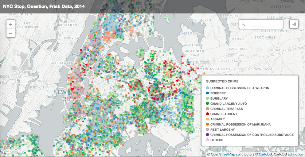
Click the map to explore the data
Next Steps
Now that you’ve created your first CartoDB map, there are plenty of other things you can do with it, such as adding additional data layers to your existing map, or duplicating the map and highlighting different aspects of the data using the other map types. If you are familiar with SQL, you can also use the SQL tool to do some basic data manipulation, perform joins, and do some basic calculations and analyses with your data sets. CartoDB also allows you to fine-tune customize the appearance of your maps using a special version of CSS with selectors that link to your data, however I will leave it to you to play with this on your own.
You can also do things like geocoding in CartoDB, which allows you to convert street addresses into points on a map, but the free account limits the number of items you are allowed to process. You could, however, geocode data in another program like Google’s Fusion Tables or QGIS, then import it into CartoDB for the visualization.
While CartoDB is a great tool for visualizing data, it’s not really meant to be a fully featured GIS system. When you are ready to move on to more advanced GIS techniques like buffering, intersects, raster analysis, or spatial statistics, I suggest checking out the open source QGIS package.
Note 1: Converting the NYPD’s stop-and-frisk data to a format usable in CartoDB
I used the free and open source QGIS package to import the raw CSV data from the NYPD website. Start by opening the Layer > Add Layer > Add Delimited Text Layer… Menu. Browse for your downlaoded data. You might need to unzip the datafile before selecting it in QGIS. Next, select the x- and y-coordinate fields from the dropdown menus (see screenshot); in the case of the SQF dataset, these are “xcoord” and “ycoord”, respectively.
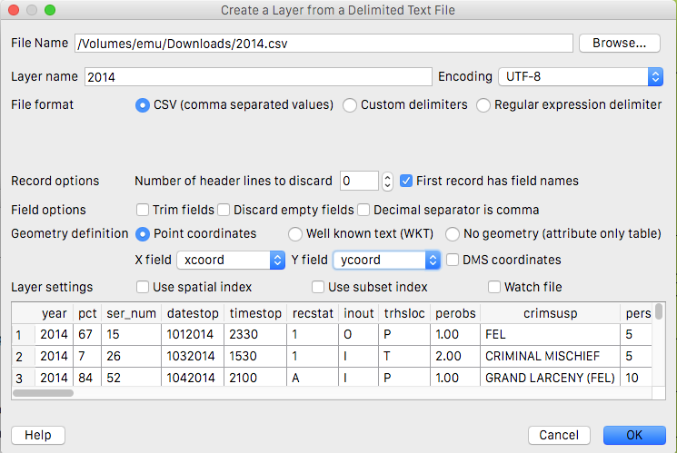
Click “OK”, then close the warning box (this is because a bunch of data doesn’t have x-y coordinates associated with them). Then you will need to select the coordinate system that corresponds to your data. In this case, it appeared that the x- and y-coordinates were in the state plane system, so I made a guess that they used the New York-Long Island State Plane system (“NAD_1983_StatePlane_New_York_Long_Island_FIPS_3014_Feet”). Finally, right-click the newly imported layer, select Save As…, select “ESRI Shapefile” or CSV or any other format compatible with CartoDB, click “Browse” to give your file a name and location, then click “OK”. If you save it as an ESRI Shapefile, you’ll need to add all of the files (.dbf, .prj, .qpj, .shp, .shx) to a single .zip file. If you’re on OS X, just select them all in a finder window, right-click, and select “Compress 5 items”. The resulting Archive.zip is the file you will upload to CartoDB.
Note 2: Use of force and Using SQL Queries
In the section where I explain applying filters, I used the “forceuse” column as a proxy for determining whether or not force was used in a particular stop. The dataset actually has several columns that indicate whether or not force was used, but the filter tool built into CartoDB doesn’t really allow us to capture all of the incidents where force was applied using those columns. The problem is that the filter tool always applies an “AND” operator between multiple filters, and not an “OR”. We want to see all the incidents where force was used, which means the use of physical force-hands, OR physical force-weapon drawn, OR physical force-etc. For these types of filters, we need to use the SQL query tool, which allows much finer-grained control over which data gets included in the active dataset.
Click on the “SQL” toolbar item. Where says “Custom SQL query”, replace the existing text with this code snippet:
SELECT * FROM table_2014_sqf_1983_sp_nyli WHERE
(pf_hands IN ('1','Y') OR
pf_wall IN ('1','Y') OR
pf_grnd IN ('1','Y') OR
pf_drwep IN ('1','Y') OR
pf_ptwep IN ('1','Y') OR
pf_baton IN ('1','Y') OR
pf_hcuff IN ('1','Y') OR
pf_pepsp IN ('1','Y') OR
pf_other IN ('1','Y')) AND
forceuse is null
When you click “Apply query”, you should see a much smaller dataset. These are the incidents where physical force was reported (the pf_hands, pf_wall, pf_etc. columns), but where the justification (forceuse column) was not reported. Notice they’re almost all clustered in a subset of precints in the Bronx, Flatbush, and East Harlem?
If you change the last part of that query, the and forceuse is null portion, to instead read or forceuse is not null, you will have a dataset with all of the incidents where the use of physical force was reported, including those instances where no justification was given.


