In light of President Trump’s recent budget announcement, the humanities is scrambling to defend the value of institutions such as the NEA and NEH against proposed cuts that would see their budgets reduced to zero. With so much on the line, it seems more necessary than ever to highlight the ways these institutions have influenced people’s lives on a local level.
The Digital Fellows, led by GC Digital Initiatives Deputy Director Lisa Rhody, have examined data from the NEH to get a sense of where and how funds have been invested since the endowment’s inception.
Tahir Butt began by parsing the XML data from the NEH, and Hannah Aizenman then converted the JSON files to .csv for easier manipulation.
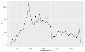
Tahir plotted the numbers of awards granted by year:
Then he started breaking it down.
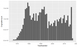

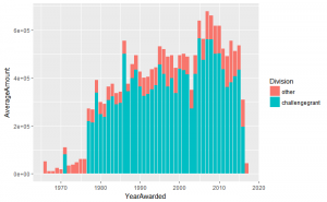
Because these initial graphs lump together Outright and Matching funds, they needed to be further disentangled. After Lisa pointed out some quirks of how NEH funding is allocated, the team separated out Challenge Grants, which are handled differently, from other grants at the NEH.

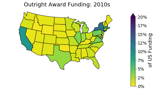
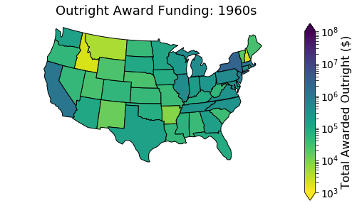
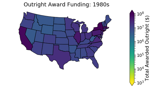
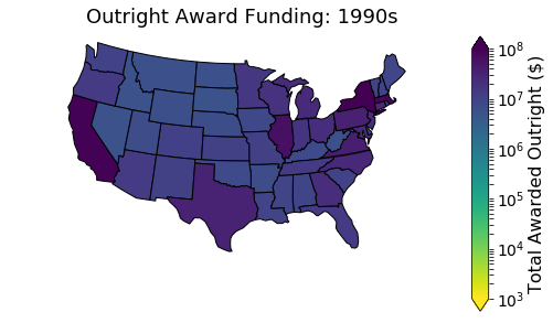
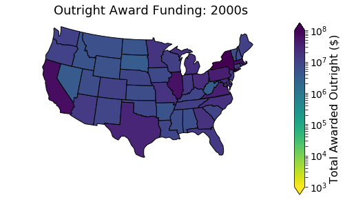
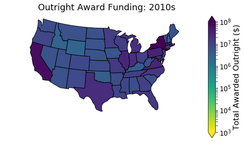
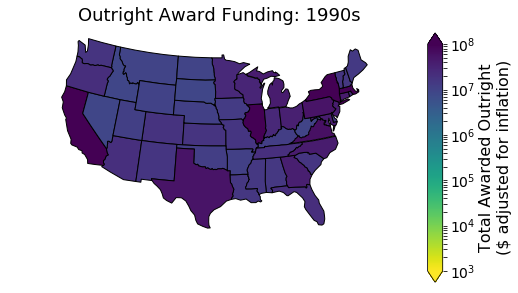
Next, Hannah mapped the awards by decade and by state:


.
Hannah also gave us a breakdown of NEH funds received at CUNY, including a breakdown by discipline.

To clarify differences, she made her findings more pronounced using color.


Addition: While talking through this data, we realized we hadn’t adjusted the numbers for inflation:


These exploratory graphs are not a conclusion, but this preliminary analysis has shown the impact of the NEH not only on our own institution, but also on middle America—states and people that Trump claims he is most concerned with.
We’re currently planning an interactive map showing in greater detail the impact the NEH has had on a state-by-state and institution-by-institution level. We want to make the case that the NEH isn’t just an important cultural institution favored by “elites”—it also has had a direct impact on local institutions that benefit their communities more broadly.
These projects take time, energy, and commitment, and we at GCDI want to get people involved. If you want to participate, please contact gc.digitalfellows@gmail.com or come by Python User Group at 12 PM Wednesdays in room 7414.
Correction: An earlier version of this blog post contained incorrect maps that have now been fixed. The code that generated these maps is available at https://github.com/story645/neh These errors came to light because Hannah was teaching a visualization workshop using this data and the code she used to create these visualizations.

