NOTE: This post is Part 1 in a two-part series that will help you begin exploring data in a spatialized way using ‘Social Explorer’. Part 2 will show you how you can download & share data tables and maps using this application.
Imagine: You are doing research on a particular geography or set of geographies – maybe a neighborhood in New York City, maybe multiple neighborhoods or geographies across the United States. You want to examine or compare the demographics of the geographies and look at a spatial representation of them, but are not at the stage where you need or want to learn a sophisticated GIS mapping platform. Maybe you’re like me you just want to explore.
What can you do?
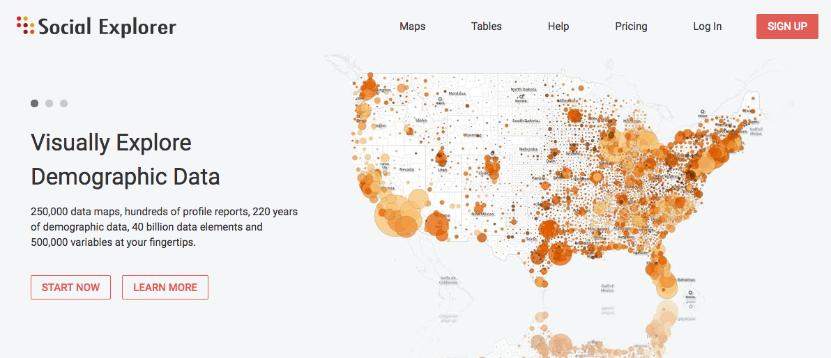
If you are a Graduate Center student*, then you are in luck! The GC holds an institutional license to Social Explorer, a web-based platform that “provides easy access to demographic information about the United States”. Through Social Explorer, users can explore demographic data from 1790 to the present in the form of maps and data tables, and can quickly download and store or share this information.
*If you’re not a Graduate Center student, check with your library to see if they have an institutional license you can use!
Below is a guide to getting started!
More specifically, this post will touch on:
- How to access the GC-licensed version of Social Explorer. This version of the application affords GC students access to MANY more features of the application than the free version at no cost to you!
- How to navigate around the application in a way that allows you to manipulate and modify the map view and begin exploring!
Accessing Social Explorer:
Before accessing the data, you’ll need to find your way to the GC-licensed version of Social Explorer. This can be done by logging on at any of the computers in the building. Once logged on, you can navigate to the Library’s section of the Graduate Center website. From there, look for the ‘Research Guides’ option, to the right of the search box.
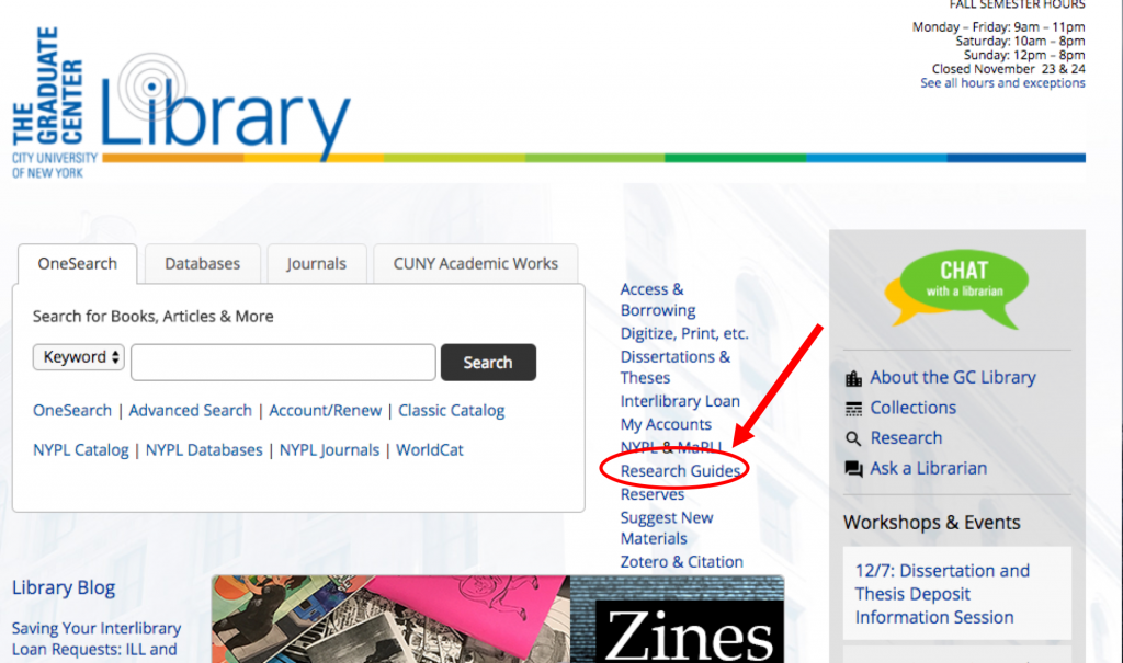
This will bring you to a long alphabetical list of all the research guides the library has amassed for us. If you didn’t know these existed, it’s worth exploring the list before proceeding to see what else might be of use to you! Scroll down until you see ‘Mapping Data’. On this page, Social Explorer is available at the bottom of the list in the box titled ‘Basic Mapping Applications’.

You’ll know you’re in the GC-licensed account when you see a grey-bar across the top, wherein to the left is reads: “Professional license provided by CUNY Graduate Center”. To begin exploring, just click the ‘Start now’ button below the slider.

Modifying the Map View:
When you first login, you’ll be presented with a zoomed out view of the contiguous United States including Puerto Rico (though parts of Hawaii and Alaska can be seen towards the periphery of the map). This initial map, as you’ll see at the top of the screen, shows ‘Population Density (Per Sq. Mile)’ and uses data from the American Community Survey (ACS) 2015, 5 year estimates. This title is embedded in one of the main tool bars that will help you manipulate and modify the map to examine the data you’re interested in.
I also want to bring to your attention the symbol of two boxes with a line in the middle towards the bottom-center of the the window. This is a feature I’ll return to later in the post, but for now, know that this button allows you to compare multiple indicators at once or how a geography has changed over time.
The first thing you’ll want to do is zoom in to the (or one of) the locales you are interested in looking at. You can zoom in to view specific locales in three ways. First, you can use the ‘search address or geography’ bar just under that main toolbar to go directly to the locale of interest. Second, you can double-click on the area of interest on the map. Third, you can use the zoom-in/out tool bar in the bottom-left corner.

As you zoom in, you’ll notice that the geographic level at which the data is presented automatically changes at certain levels of zoom.
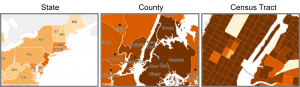
If you look at the main toolbar, you’ll notice that it tells you what geographic scale you are looking at. This tells you that as you zoom in, the scale changes from state-level, to county-level, to census-tract level. This is important because it’s important to know what scale you’re looking at, but also because it is here that you can have more control over the scale at which the data is presenting.
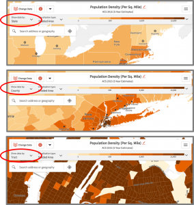
If you click the down-pointing arrow, a menu will open and you’ll see that the default setting is for the application to automatically select the scale at which the data is presenting. If you turn set that default to ‘off’, you can examine the data by a number of scales no matter how zoomed in or out you are on the map.

This feature is really useful when trying to understand specific geographies at multiple scales. For example, in my own work in Long Island City, I like too zoom in very close and examine demographics at the census tract level, but I also like to understand how this neighborhood compares with the rest of Queens County and New York City. Moreover, I like to oscillate between examining Long Island City at the census tract level and at the zip code level since sometimes zip codes are more meaningful when sharing data with others – say, community members – while census tracts give us a more finite and complex understanding of what’s going in a particular zip code.

Along the lines of comparing data across and within geographies, turn your attention back to that button at the bottom-center of the window. When you click on that button, a menu with 3 options will appear.

The first option allows you to view the data as you are, from a singular perspective. The second option allows you to exam the same geography from multiple perspectives at once. This could be as simple as examining the county-level characteristics while also examining the characteristics of the census tracts that roughly fall within that zip code. It is also useful for looking at changes over time (i.e. population density in 1970 versus population density in 2015), or examining how different factors (i.e. race and income) overlap within a specific geography. The third option allows you to achieve a similar goal, but to change between the different perspectives by sliding the button – now in the center of the screen – to the left or right.
The last, though certainly not the least, key to modifying the map to meet your exploratory needs, is to change the data. In the upper left-hand corner you’ll see a button labeled as such. When you click on that button, a menu with a range options neatly organized by topics for you will appear. At the top of the menu, you’ll see two tabs, ‘Browse by Category’ and ‘Browse by Survey’. Through either of these tabs, you can select indicators to visualize on the map. The default view is ‘Browse by Category’. In order to explore and visualize different indicators, you can click on a topic and scroll through the list. By clicking on the ‘Browse by Survey’ tab, you’ll see you there are a number of different surveys from which you can extract data – ACS, Census, FBI Crime Data, Health data, Religion data and so on. When you select different Surveys, you’ll notice that the ‘Table’ options may change. By selecting different tables, you’ll be presented with different variable options to view on the map.

If you return to the ‘Browse by Category’ You’ll also notice that at the top you can view data from different years, dating all the way back to 1790. Note that though there are data available for all of those years, the data is not necessarily the same across time. More specifically, you’ll notice that as you move through the time periods that certain variables have been added, broken apart into multiple variables, or removed. Even when variables appear to be consistent, you should check the parameters of each dataset to determine how comparable the figures are. For example, I have used this application mostly to visualize data from the Census and the American Community Survey. There are significant differences between these two data sets – from what data is collected, to how the data tables are populated, to the accuracy of the data presented. For more, here is a “Detailed Comparison of Decennial vs. ACS” data by the Library at North Carolina State University.
Once you’ve selected an indicator, you can begin exploring the geography. At first you may just want to look using the color-coded key at the top to make sense of the patterning of colors that cover the map. If you want more concrete data information, you hover over a sub-geography (a specific census tract or county, etc.) and it will become outlined and an information box will appear. This box tells you what sub-geography you are looking at (“Census Tract 19, Queens County, New York”, in the image below), and offers data points relevant to the indicator you selected.

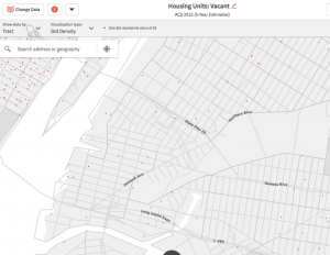
The color shading is not the only one way of visualizing the data in Social Explorer. You can also render the data as bubbles or dots. While bubbles tells a similar story as the color shading, dot density allows you to get an even more exact sense of the geographic character of the indicator you are examining.
Ok –now you are ready to go forth and EXPLORE! And I do encourage you to spend some time just looking at your geographies of interest through the lens of different variables and by visualizing these different variables at different scales and in different ways (i.e. shading, bubbles and dots). During this exploratory period, I find the comparison tool (bottom-center button) to be very useful. I also encourage you to take notes on what you’re seeing, what catches your eye and what seems odd or unexpected.
In Part 2 of this series, we’ll zero in on how to look more closely at the data, how to download data tables and save and share maps, and to begin crafting stories using the information gleaned from Social Explore. Stay tuned!