
In the mapping workshops that we offer, a recurrent question refers to where to get the data. Every time students attend one of these workshops, all the datasets are given to them, so it is understandable that many might wonder where the instructors get this information from. This is what inspired us to develop a new workshop this semester, Finding Data for Mapping: Tips and Tricks. But since not everyone could be present for the workshop on October 3, I’m taking the opportunity now to share a few of the tips and tricks we discussed to find data to make maps for your academic or pedagogic work. In a way, this will be a “prequel” (since they’re so popular nowadays) and a complement to the Intro to Mapping using QGIS post of a few years back.
First things first: how does mapping work?
When you create a map you’re doing more than just drawing geographic boundaries and putting colors that represent something; you are combining non-spatial data to spatial features. To do this, we are going to need specialized software, called Geographic Information Systems (GIS). QGIS is just one of the many options available out there, and my personal favorite because it is free (unlike the also popular ArcGIS), it is versatile and it is open-source. So I will use QGIS as the base for the examples given in this post, but bear in mind that this can apply to any GIS software or platform you decide to use (for instance, for the workshop, we used Carto). In the image below you will see what a typical GIS graphical user interface (GUI) looks like.
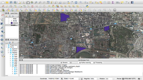
You can see there’s a map, some purple shapes, a box of “layers” to the left and lots of buttons all over. The purple shapes are vectors that serve to represent spatially elements of your data. In that image, the purple shapes could be construction sites that are relevant to a specific study, for example. Each one of these construction sites could have other information that we find relevant, that we could have in a spreadsheet or a text document. Here is an example.

We can see that the dataset contains data of three construction sites, including area in square feet, number of workers, estimated completion date and whether it is active or not. What we do in GIS is basically join together shapes that have no information, with information that has no shapes, so that we can perform a spatial analysis or create a nice visualization about the construction sites.
Data Organization
In GIS, data is organized in layers. Each layer usually has vectors (shapes) that are represented graphically in space, and an attribute table, which shows the “spreadsheet” of all the different variables (or attributes) that each element (or feature) in the layer has. Note that you might also have a layer that has an attribute table with no vectors associated to it, or layers of vectors that have no attributes. But neither of those are hardly useful in GIS analysis, and that’s why I’m going to teach you how to join these two types of data so that you can explore new analysis methods on GIS.
The four steps
Now that you have a better idea of how GIS works, let me introduce you to the four steps we will follow to get your data into QGIS:

We will practice these four steps by creating a map of the median age per state in the U.S.A.
Step 1. Find your data
Something that is very important before you start looking for your data is what I could have called Step 0: Planning. In this stage, before you do anything, ask yourself: What is it that you want to do? What do you already have? What are you missing? Try to visualize the final product: Do you want a map to help you in your analysis? Do you want it just to visualize and make others have a better understanding of your work? Maybe both? Finally, you may want to think of the scale: What is it that you want to represent in a map? Is it countries? Is it cities? Is it trade routes? Or perhaps just individuals, or locations of restaurants? This will help you understand what you have to look for. From here, let’s go over the possible scenarios.
Scenario 1. You already have the data, you’re just missing the maps.
You might already have data from your research or work, likely in a common spreadsheet format such as Excel. Or, you have it in statistical software such as SPSS or SAS. In any of these cases, it is advisable that you convert your data files into comma-separated value text files (CSV files, for short). In Excel it is as simple as changing the “Save as…” format in the extension drop-down menu, while in other software you might have to search for an “Export Data…” section in the File menu. CSV files are universally readable; most data analysis software is able to read these files.
Scenario 2. You don’t have any data at all.
You might have an awesome research idea, and a lot of motivation, but you don’t know where to begin. As obnoxious as this may sound, I have to say it: Google (or your favorite search provider, for that matter) is your friend. Seriously, there’s high chances that some/most/all of the data you’re interested in analyzing has already been compiled by someone, so the most practical thing you can do is look up keywords associated to your research interest. This someone can usually be government agencies (municipalities, federal agencies, etc.), who generally provide data for free. This is the case of the Census data, for example, which is one of the most commonly analyzed data. Other typical data providers are universities, research groups, NGOs, and individuals with an interest in open access to information. As a last resort, there are also private sector companies, consulting agencies, who might offer data – for a price. Or you can go out to the field and capture data of interest yourself (and maybe you’ll consider sharing it with your peers for free).
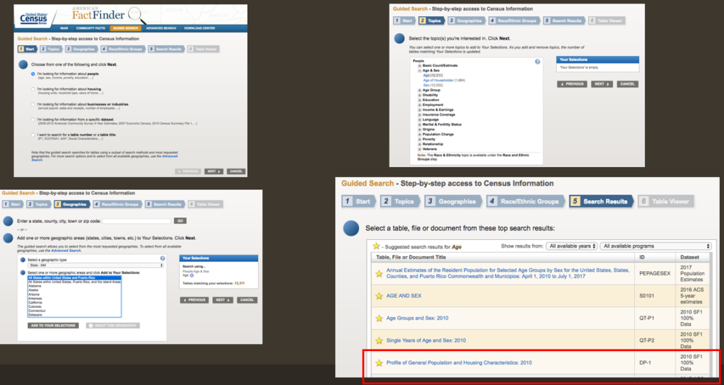
For our exercise, we will need to find median age per state for the year 2010, since that is the last year a Census took place. To find this dataset, navigate your way to the American FactFinder within the Census website, look for the Guided Search, and then you can follow this to get the data of Median Age per state:
- On “1. Start”, choose “I’m looking for information about people”.
- On “2. Topics”, choose “Age” under “Age & Sex”.
- On “3, select “State 040”, then choose “All states within the United States and Puerto Rico”, then click “Add to your selections”.
- Skip Step “4. Race/Ethnic Groups”.
- On “5. Search Results”, click on “Profile of General Population and Housing Characteristics, 2010”.
- Click on “Download” on the top bar above the dataset.
- To get a cleaner dataset, Click on “Use the data” and make sure both boxes “Merge the annotations into a single file” and “Include descriptive data element names” are UNCHECKED. Then proceed to download.
Metadata
Once you download and unzip the file, you’ll notice that there are several different files in the folder. Among them is a readme file that explains what each of the files are, or you can infer what they are from the names. There will be three csv files: one contains the dataset; the other one is an annotations file and the last one is the metadata file. Go ahead and open your dataset. You will realize that all of the attribute names are coded (HD01_S001, HD01_S002…). So how do we know which one is median age? The answer is in the metadata file. Go ahead and open it and do a search for “median age”. You should find two values: HD01_S020 and HD02_S020, the former is the actual value and the latter is a percent. We only need the actual value, and we will continue working on this on Step 2, Cleaning the data.
Finding Shapefiles
In either scenario, will need to find a map that will help you visualize your data. Let’s suppose you’re interested in analyzing Census data, but you’re still not sure of what scale you’re interested in, that is, you don’t know what shapes you want your data represented in: maybe State level? Or county-level? Or blocks? Or tracts? The best thing you can do is look up what are your options. So go ahead and use your favorite search provider and type “census shapes”. The first option will read something like: “Tiger/LINE Geography – U.S. Census Bureau”, and that is precisely what you’re looking for (that’s why I said Google was your friend!). If you click there, you will be able to see all the different shapes that the Census Bureau offers for analyzing their data. These shapes are distributed in “shapefiles” (.SHP extension), which is one of the most common formats to share vector shapes. If you’re looking for something other than Census data, try searching for “keyword of your research” + shapefile in Google, and see if anything comes up.
In our exercise, we’ll use States, and since we are using Census 2010 data, let’s download the 2010 shapefiles. Although states have not changed their shapes, it is good practice to download shapefiles of the same year than the data you intend to use, and it is especially important if you’re looking at data at the census tracts level for example, because census tracts may be redefined for every Census.

Some of the layer types offered by the Census Bureau include Census Tracts, Counties, School Districts, ZIP Code Areas, but also Roads, Railroads…
There are two important things worth mentioning of shapefiles. First, is that they might have some data, but they are usually empty; picture them as empty containers in the shape of countries/counties/tracts/etc. where you can pour all your data into (wink to Olivia). Second, they are a common yet ancient file type, which means they have their annoyances/limitations. Worth mentioning: a) they never come alone, but they are (and must always be) accompanied by several other files with the same name but different extensions (.prj, .shx, .dbf, etc.), which is why they’re typically shared as zip files (that most GIS software can open directly); and b) the attribute names are limited to 10 characters, so if one of your attributes is “Estimated Completion Date”, it will be truncated to something like “Estimat~1”, which is why it is recommended to use codes such as “EstComplet” in the example above, or Save into a different format. Now you know why generally datasets use coded attribute names, as we saw earlier in the Census file.
Step 2. Clean your Data
Cleaning your data is as important as finding the proper dataset. If you do not have proper “data hygiene”, you risk getting lost in your own data, or even worse, having spatial operations give wrong results or shift your data. Concerning the attributes on your attribute table, a good rule of thumb you can apply is: if you are sure you don’t need it, make sure you delete it! In our example, since we are only interested in Median Age by State (HD01_S020), we can safely delete everything else, with one exception. You will need to keep another attribute that identifies your data, so that you know what value corresponds to which states, and so you have one common element between the dataset and the shapefile in order to make the spatial join. The example dataset has three possible identifiers: GEO.id, GEO.id2, and GEO.display-label. Whichever you choose, the one thing you must make sure is that the shapefile that you intend to use as the “container” of your data uses an identifier that is compatible with your dataset. Alternatively, you can opt to keep all three identifiers in case you’re intending to join with other datasets that might use one or the other identifier.
Go ahead and open QGIS (if you haven’t installed it, here’s the download link. Choose the latest standalone installer. Follow instructions carefully, especially if you’re installing on a Mac). Then, we will add data (click on the add data button – see image below), then choose Vector as the type of data and look for either the Tiger/line Zipfile downloaded from the Census website or the .shp file from the uncompressed zip file folder. Either way works.

Once you click on Accept, you should see a map of the United States of America pop up in your QGIS map window. To the left of the map, you will see a box called “Layers”, and in there you should see something like “tl_2010_us_state10” (the name of the vector shapefile you just added). If you right-click on it, a menu will pop up, and you will be able to open the Attribute Table. When you do, a spreadsheet will pop up. This is the data in the shapefile. Each row is represented by one polygon (or more, in the case of Hawaii for example), and selecting one row will also select its corresponding polygon(s) in the map. We do not have a metadata file available for this, although the metadata is available in the Tiger/Line website, but let’s practice what to do when you don’t have it. We can recognize at least three identifiers: Statefp10, Geoid10, and Name10. If you compare the dataset and the shapefile, you will notice that Geoid10 seems to correspond to Geo.id2, but we are going to use GEO.display-label and its counterpart Name10, you’ll find out why later on. It is unimportant that the feature names are different, but be warned, the names of the states must match or the join will go wrong! A typo will make Massachusetts completely different from Massachusets, recognized as a different state by the software. Even a space after “Alaska ” will make it totally different from “Alaska”. I can confirm that in this case the names match so you will not have any join issues, but keep this in mind when verifying future joins.
Step 3. Join database + shape
Now that we have QGIS with a shapefile open, and a clean CSV dataset that only contains median age and an identifier, it’s time to add the dataset to QGIS to perform the join. To do this, click on the “Add data” button (same button we clicked to add the vector shapefile), but this time we will choose “delimited text” data. Browse your computer for the clean_data CSV. In the “geometry definition” option, click on “No geometry”, then click on Add. Once you do, you will notice that nothing happens on the map, but a new Layer was added to the layers box. If you right-click on this new layer and open the Attribute Table, you will see your dataset.
To join this dataset to the shapefile, you will have to select your shapefile on the layers box (not the CSV dataset). Right-click on it and select “Properties”. There you will see the information of the layer, but what we’re looking for is the Joins tab on the right side. When you find it, click on it. An empty box will show up. The “+” sign means “Add join”, so click on it and a new dialog box will pop up.

In this box, the clean_data layer is selected as default for the join because there’s no other layers available in your QGIS project. Here you will have to tell QGIS which feature of the dataset corresponds to what feature of the shapefile. As we had said earlier, we will use Geo.display-label and Name10, so look for them in the appropriate drop-downs. You can optionally choose which fields are joined, I’ll just have it join everything. Then, you can choose a custom field name prefix, that will be added to every attribute name joined. To avoid cramming the space of the feature names, I usually choose to have a short prefix, such as “” or “a“, “x_” and so on. You could also just put nothing “” but I do not recommend this because you might lose track of where an attribute comes from in case you have to trace back your steps. When you’re ready, click OK, then you will see the join show up on the box, and now you can click OK to close the properties dialog box.
You won’t be able to see any changes until you open the Attribute Table of the vector layer. Go ahead and do it. You will see that _HD01_020 (along with any other identifiers you joined) now are shown at the right end of the attribute table. Congratulations, you performed a join!
Step 4. Verify the join
Just like in programming, it is very common for a tiny typo or error in the procedure to affect the rest of the work, so verifying is an important step in the joining process. A simple verification is to take two to three random values in the post-join layer and make sure they correspond to the values of the original dataset. A common problem is to see a one or several attributes show “NULL”. This tends to happen when the names of the join attributes did not match. This is exactly what could have happened if you chose to do the join using Geoid10 and Geo.id2, because although they are technically the same, they are formatted differently: QGIS recognizes Geoid10 as a String (text), while Excel identified Geo.id2 as an integer (see image below). The problem comes because when Excel interprets this as an integer, it automatically removes the “0” to the left, which is kept in the shapefile, so “01” does not correspond to “1”, and so on. One way to avoid this automatic conversion is to create a .csvt file, which should be in the same folder than the original csv file (more information on how to create a csvt file here).

Now that you have a valid and verified join, I suggest you save your vector layer so that it will keep the new data joined as part of itself. Right click on the vector layer in the layers panel, then click on “Save as…”. I suggest saving to a format other than shapefile. For example, Spatialite. This format has worked just fine for me so far.
Bonus step: visualize your data!

Tips and Tricks
Now, I would like to share with you a series of tips and tricks, coming from conversations in the GIS/Mapping Working Group, consultations with students and faculty, issues raised during workshops, and our own work using GIS.
Think of an effective system to manage your datasets.
- Organize data in thematic folders. Subfolders are also welcome if you have a data that spans along different dates, or other varying characteristics.
- Put dates of data source or describe changes made in the file names (e.g. mappluto 2017 with geoid.gpkg)
- Take into account it is easy to get lost in your own data. Being organized is a must!
- Also take note that datasets might be very, VERY large. Operations such as “join” can take ages. And be sure that your file system tolerates large file sizes. For example, the CUNY SPH Sharepoint doesn’t allow opening files over 100MB. Oops!
If you can’t find the dataset you’re looking for or if it is outdated, do not hesitate to contact the responsible agency. Call them on the phone or e-mail them!
- Some datasets are not published as open data but they might still be available for whomever asks for them.
- Sometimes the data is out there, but the website is not user-friendly. I’ve been helped over the phone to navigate the website to find the data before.
- Always go to the original data source if you can help it.
If the software you’re using doesn’t recognize the file you want to open, don’t panic. Software like QGIS can convert file types to virtually any other type that could be read by the software or app you want to use.
Before running a complex analysis on datasets you have, be sure to do a quick online check. There’s a chance someone has done a similar analysis that you could use. Don’t reinvent the wheel.
In software like QGIS, layers with different projections can be aligned on the fly. STILL, it might be a good idea to reproject them so they are all on the same projection.
- Some operations such as Clip and Intersect may give strange results otherwise.
If you’re stuck, seek help.
- Some online forums (such as qgis.stackexchange.com) can help out A LOT.
- Posting questions on the GIS/Mapping Working Group can also be productive.
- Coming to GC Digital Fellow Office Hours! (apologies for self-publicity but it’s true)
Data source links/examples
These are places you can visit and explore, to find datasets or shapefiles you need to do some analysis or just for the fun of it.
- New York City Open Data
- The Baruch Geoportal
- CUGIR
- GeoLode
- OpenGeoPortal
- Wikipedia “List of GIS Data Sources”
- Liberating data from NYC property tax bills
Photo credit: Join by Craig Rodway (2009). Creative Commons License.

This entry is licensed under a Creative Commons Attribution-NonCommercial-ShareAlike 4.0 International license.

