 In March 2020, when the COVID-19 virus started to spread throughout New York City, former Digital Fellow Javier Otero Peña and I got together to think about the ways mapping could be used to identify some of the challenges produced by the pandemic. At the time we were co-coordinating the GIS /Mapping Working Group on the CUNY Academic Commons and over the years we had seen the many ways that GIS users throughout CUNY were constantly trying to use mapping to address some of the most current and urgent social issues. We strongly felt that it would be valuable to bring these GIS practitioners together with on-the-ground activists to come up with a mapping project that could be used to meet the needs of the current moment. In particular, we were interested in understanding how the pandemic was affecting vulnerable communities in New York and what could be done about it. We scheduled a virtual brainstorming session for April 17th and invited colleagues throughout CUNY and beyond.
Before the brainstorming session, we asked registrants to send us any maps that they had come across that addressed some aspect of the pandemic; we did this to avoid duplicating existing efforts with our mapping project. We also asked registrants to send ideas about potential maps that we could develop together. We included the research of existing maps and the recommendations for potential maps in a working document and sent it out to all participants before the call.
Over a dozen students, professors, and activists joined the session. By the end of the call, we had seven pages worth of ideas, which included mapping how COVID is affecting the neighborhoods where CUNY students live, mapping where there is a shortage of staff in medical facilities, and mapping vacant housing units as a way to show the contrast between the unsheltered population and the amount of property that remained unused in New York City. After the call, we encouraged participants to add to the working document and to indicate which projects they would be interested in working on. In the end, the group decided to pursue not one, but four mapping projects that focused on the intersections of COVID and food insecurity, housing, climate change, and incarceration. Once we had the teams established, we sent out a notice to a number of GIS listservs, asking if anyone else would like to join the efforts. To our surprise, we had over 100 people from around the nation reply! Each team ended up having between 10-25 members.
Each team had one team lead, whose responsibilities included setting up virtual meetings and keeping members on task. Generally, team members would meet once a week to report back to each other on what they had accomplished and to brainstorm the next steps. It was in these spaces that activists could say what they had been experiencing and hearing and researchers could add their expertise on how to find and process data related to the unfolding situations. Most teams also set up a Slack workspace to stay in touch between meetings.
Taking on this effort during a pandemic proved to be as difficult as it sounds. While many people were excited about joining and wanted to use their skills to make a difference, one challenge that we faced was retention. For various reasons, people had to leave the projects before completion, and two of the projects—focusing on COVID and climate change and COVID and housing—weren’t able to be completed. Regardless of their completion, I am so grateful for the work that was put into those projects and I hope that working with GIS practitioners and activists from around the nation was a fulfilling experience for all folks involved; their efforts and collaborations certainly inspired me!
The other two projects—”COVID and Cages” and “The Food Chain”—were successfully completed. I am proud to share below the information about those mapping projects. As a member of the COVID and Cages team, I am also grateful to the GC News and Communications staff for featuring the mapping project on the Graduate Center homepage. Lastly, I invite anyone who’s interested in exploring GIS and mapping to join the GIS/Mapping Working Group on CUNY Academic Commons.
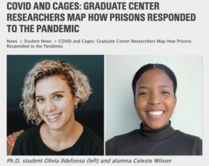
COVID and Cages
Team Lead: Celeste Winston, Ph.D.
Lead GIS practitioner: Olivia Ildefonso
 COVID and Cages sought to discover how the pandemic is affecting incarcerated people in the United States. Since prisons and jails are sites where social distancing is impossible to attain, it was obvious that America’s prisons would quickly become COVID hotspots, putting at risk the lives of inmates and all who work inside of the prison system. In order to get access to relevant data, members of the team partnered with The COVID Prison Project, an initiative started by a group of interdisciplinary, public health scientists to create a public database on the state of COVID-19 in America’s correctional facilities. With access to a wealth of data from The COVID Prison Project, and additional data from UCLA Law Covid-19 Behind Bars Data Project, and the Vera Institute of Justice, the team created two different maps.
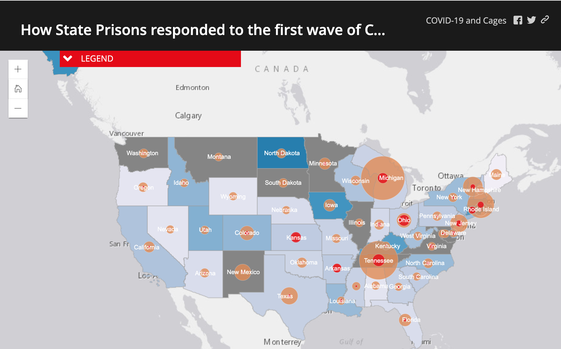
How State Prisons responded to the first wave of COVID in the US

As a response to the spread of COVID-19 in prisons, many states announced plans to reduce prison populations by releasing inmates who met certain criteria: often people nearing the end of their sentences, who were convicted of nonviolent offenses, and/or who comprised at-risk populations. Despite these new regulations, reductions to state prison populations had been minimal; by May, the average state prison system had reduced its population by just 5%.
The first map from the COVID and Cages team shows that by April 30th, states with some of the highest rates of COVID cases amongst state prisoners had released just a small percentage of their prison populations. In Ohio state prisons, for example, where the case rate stood at approximately 90 per 1,000 incarcerated people on May 21, there was only a 2.6 percent reduction in the state prison population in April. By contrast, states like Alaska, Iowa, and Rhode Island that released larger proportions of their state prison populations in April had seen smaller case rates. In general, the state prison systems that had larger population reductions had seen much smaller case rates compared to state prison systems with more limited releases.
In summarizing the results, the COVID and Cages team argued that the map provided evidence for the immediate need for widespread decarceration. They further explained that “in the context of the COVID-19 pandemic, prisons have become clear epicenters of crisis as people locked behind bars face higher risks of contracting the virus while systematically lacking access to quality healthcare,” adding, “Prior to the pandemic, incarceration itself was already a health crisis” with this being the latest chapter in a long history of epidemics and diseases spreading throughout prison and jail systems with little recourse or relief.
COVID19-Related State Prison Incarceration Reprieves in Pennsylvania by Committing County
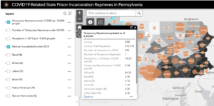
The second map from the COVID and Cages team focused on Pennsylvania, one of the few states to release data on their temporary release program. The team found that the state only actually released a fraction of the people who were qualified. In May, Pennsylvania had over 41,000 people incarcerated in its state prisons. Under the temporary reprieve program, approximately 1,500 to 1,800 incarcerated people would have been eligible. However, as of July 14, 2020, only 159 people had their sentences reprieved through the program (Pennsylvania Department of Corrections).
The team also found that counties with significant Black populations were half as likely to receive re-entrants compared to the average. While they were unable to know the race and income of the people released under the temporary reprieve program, the team stated that these statistics raised a concern that Black people were less likely to be released and were therefore more likely to be exposed to COVID-19 in Pennsylvania’s state prisons. Additionally, they suggested the need for continued attention to this issue since understanding the racial and economic contexts in which re-entry is occurring is an important step in holistically addressing the needs of formerly incarcerated people and their communities.
The Food Chain
Team Lead: Lucienne Canet
Team members: Elena Abou Mrad, Regina Biswas Thomas, Donna Auguste
![]() When COVID started to spread throughout the United States there was an immediate reaction in America’s food chains. Food banks across the country began to run out of food, while farmers in the Midwest and across the country were dumping milk and eggs, potatoes and onions and euthanizing hogs and chickens because they could not be sold to shuttering restaurants and other food-centered businesses. Though the government had ordered meat plants to stay open, there had been no coordinated effort to save produce, fruit, and dairy.
When COVID started to spread throughout the United States there was an immediate reaction in America’s food chains. Food banks across the country began to run out of food, while farmers in the Midwest and across the country were dumping milk and eggs, potatoes and onions and euthanizing hogs and chickens because they could not be sold to shuttering restaurants and other food-centered businesses. Though the government had ordered meat plants to stay open, there had been no coordinated effort to save produce, fruit, and dairy.
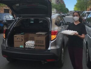 With this in mind, The Food Chain got to work to build a network of over 100 food transport volunteers from across the country to help drive shipments of food from the Midwest to the East Coast. The first “food rally” of three different cars delivered 100 dozen eggs from Zimmerman Farm in Pennsylvania to a food pantry in the Bronx. Once the team had a successful rally, they focused on developing maps that could help them find the shortest routes between farms, volunteers, and food banks.
The Food Chain projects’ mapping and data volunteer team aggregated and presented cleaned data to the communications and food transport volunteers. This data was accessible as a Google spreadsheet and included address and contact information for farms, food banks, and volunteers. You can read more about this mapping process in these two articles authored by team members: “Data for a Farm-to-Food-Bank Volunteer Project” and “Support Veteran-Owned Farms with an Innovative Interactive Map.”
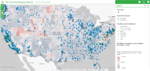
The Food Chain team also created a public web map to equip food transport volunteers with information and navigation capability on their mobile phones. Each point on the map, when clicked, opens a pop-up menu for information. With the app, the volunteers could use the “Navigation” link in the pop-up menu for directions, and automatically open the address in Google Maps.
The team also made a considerable effort to account for race and class disparities in both the access to food and the ability to sell food. Aware that farms owned by people within marginalized communities might be overlooked by some methodologies, the team specifically noted the importance of including and annotating farms owned by people within marginalized communities — e.g., farmers who are Black, Latinx, indigenous peoples, veterans, LGBTQ+, and or differently-abled people. The team also included a median household income layer to motivate users to recognize food apartheid in their neighborhood related to food networks’ locations.
For more information about The Food Chain’s “Food Sovereignty Network Map” and the process of making the map, please see this detailed article by team member, Regina Biswas Thomas.

This entry is licensed under a Creative Commons Attribution-NonCommercial-ShareAlike 4.0 International license.

