Introduction to Keyframes
If, like me, you once enjoyed playing around with the defunct Adobe Flash software, or if you have any general graphic design, animation, or video editing experience, you might be familiar with the idea of keyframes. Today they are used even in web development to create a variety of interesting effects for web pages. In this post I’d like to discuss the basics of using keyframes in Cascading Style Sheets (CSS), which is the language used to style HTML. (For a general introduction to CSS, see here). We’ll create a basic HTML page and style it using CSS keyframes to create some basic animations.
Keyframes in Practice
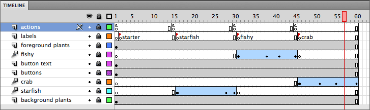
In modern media production, keyframes are markers (specific locations) on an animation timeline. If we consider that all animations have a start and end point, and that a particular object will transform or move throughout the duration of an animation, keyframes are what mark the significant moments of this transition, and from which we can determine all other intermediate transitions. In the screenshot of the old Flash software above, for example, keyframes are represented by the dots, rectangles, and diamonds throughout the timeline, indicating where changes (starts, ends, new objects, etc.) are happening.
It’s worth pointing out that before digital editing, each “keyframe,” and all intermediate frames, had to be drawn by hand. Now, animation programs will automatically fill in the transition between two or more keyframe points based on the parameters you have set: this is a process called tweening, named after the “inbetweeners” traditional animation companies would hire to draw intermediate frames of animations.
Using Keyframes in CSS
CSS allows you to create some very cool animations on a webpage with its own built-in animation tools. You can add all sorts of nifty animation effects to a given element on a page using keyframes. You can move an element, scale it, transform it, change its opacity, add stylistic effects, and much, much more.
Let’s jump into a simple example.
Setting Up The HTML
First, let’s create a basic HTML page that we can style with CSS. For convenience, I have provided the basic structure for a page below. Simply open your favorite text editor (such as VSCode) and create a new .html file with the following:
<!DOCTYPE html>
<html lang="en">
<head>
    <link rel="stylesheet" href="keyframes.css">
    <title>Basic Animations Using Keyframes</title>
</head>
<body>
    Here is some text.
</body>
</html>
As you can see in the head tag, we are adding an external CSS stylesheet named “keyframes.css” to our page. While you can use both internal and inline CSS styling, it is usually best practice to create a separate (external) file that contains your CSS code, so that’s what we’ll do next. To learn more about internal, inline, and external CSS styling, you can follow this link.
CSS Keyframes Example #1
In the same folder as your HTML file, create a new .css file named keyframes.css. Let’s create a basic animation loop using keyframes that will repeatedly fade in and out our “Here is some text” message:
@keyframes anim-fade-in-and-out {
  0%,100% { opacity: 0 }
  50% { opacity: 1 }
}

.fade-in-and-out {
  animation: anim-fade-in-and-out 2s infinite;
}
Let’s break this code down.
Basic Syntax and Structure
Keyframes are created in CSS using the “at-rule” (@) with the keyframe identifier. You also need to declare the name of the animation—we have done so here by calling it anim-fade-in-and-out, describing in bare terms what sort of animation we are creating.
To control the “timeline” of animations, the CSS keyframes rule uses percentages, with 0% indicating the start of the animation, and 100% signaling the end. Because we want our text to fade in and out (changing its opacity), we will set the beginning and the end of the animation to 0 opacity, meaning the text will be completely transparent. At 50%, or halfway through the animation timeline, we’ll set the opacity to 1, so our text will be fully displayed at that point. Note that you can control the timeline of an animation by using any percentage between 0% and 100%, and to create a smoother fade effect we would probably want to specify more transitions along the timeline.
To use our keyframe animation, we need to declare it as a style. This will allow us to apply it to an element in our HTML code. We do so by creating a new fade-in-and-out style. We indicate we are using an animation with the animation property, followed by a colon, along with the name of our animation. It is important to keep in mind that keyframe animations are meant to be general and reusable: you can easily apply them to specific selectors with the animation property and the associated name.
There are a few things we need to include next. First, we declare which animation this element will utilize (anim-fade-in-and-out). Next, we need to indicate the duration of the animation, which we’ll set here to 2 seconds. Lastly, we need to specify how many times the animation will loop. We set it to infinite here because we want the loop to repeatedly run.
Now that we have our animation set up, let’s apply it to our text in the HTML doc:
<h1 class="fade-in-and-out">Here is some text.</h1>
To make the text a bit larger, we set it to an h1 header tag. To apply our style on the element, we then set the class to our fade-in-and-out animation.
If you save your files and open the HTML file in a browser, you should now see the text “Here is some text” fading in and out on the page:

Congratulations! You have just created your first keyframe animation.
CSS Keyframes Example #2
Let’s go ahead and create another simple example. We’ll create a box object containing some text that will “slide in” across the screen onto our page.
To begin, add the following code to your CSS file:
@keyframes slide-in {
  0% {
    transform: translateX(-100%);
  }
  100% {
    transform: translateX(0%);
  }
}

.box {
  animation: slide-in 1000ms;
  width: 100px;
  height: 100px;
  background: slateblue;
  text-align: center;
  place-content: center;
  padding: 8px;
  display: grid;
}
First, we create a new keyframe animation called slide-in. Next, we specify the points of transition in our animation using percentages, again with 0% as the start and 100% as the end.
To move the position of our box across the screen, we use the translateX function. The translate function repositions an element horizontally (on the x-axis) on the screen, and takes a length value that determines how much a given element will move. We first set the position to a value of negative 100%, so our box will start in a position offset of our screen. At the end of our animation, we move the box to a position just inside the bounds of our screen (on the left-hand side).
Next, we define our box element. Like before, we first need to specify our animation property, this time using our newly created slide-in effect. We then define some general parameters for our box, giving it a width, a height, a color fill, padding, and some positioning of the text inside of the box so it appears centered.
Next, in the HTML body, let’s add our box:
<div class="box">Here's a sliding box.</div>
If you save and refresh your page, you should now see something like the following:

Congratulations! You have now created another simple animation.
As you can see, keyframes allow us to very quickly and easily spice up our webpages. While the effects we have created here are very simple, with a bit of work keyframes can allow us to create some very complex and interesting animations that can help set your webpage apart. They are a very versatile tool to add to your CSS skillset and can also just be a lot of fun to play around with!
Additional Resources
To further explore and understand using keyframes in CSS, I’d recommend the following guides and resources:
The W3 Schools entry on keyframes
This nifty in-browser app that let’s you quickly visualize your CSS code
This tutorial from TutorialRepublic
This introduction to keyframes by Smashing Magazine

This entry is licensed under a Creative Commons Attribution-NonCommercial-ShareAlike 4.0 International license.


)